Using Shiny for interactive displays of health data: The Scottish Burden of Diseases

The Accelerator programme
The Accelerator programme run by The Data Lab between 19 April 2018 - 06 September 2018 was a Scottish Government collaborative project, open to employees of the Scottish Government, the Information Services Division, the National Records of Scotland and Registers of Scotland. Employees applying to take part had a background in statistics, economics, operational research and social research, and sought to improve their data skills across a variety of areas.
For instance, I mentored one of the applicants as part of this initiative - Maite Thrower (Senior Analyst from Public Health Intelligence, ISD within NHS / National Services Scotland), and supported her in her journey to learn R and Shiny in order to create insightful visalisations for the Burden of disease in Scotland, including over 100 conditions and injuries. Previously, the complex Scottish Burden of Disease data had been visualised using static graphs, hence it was essential to transition to more powerful interactive visualisations via Shiny.
Burden of diseases data
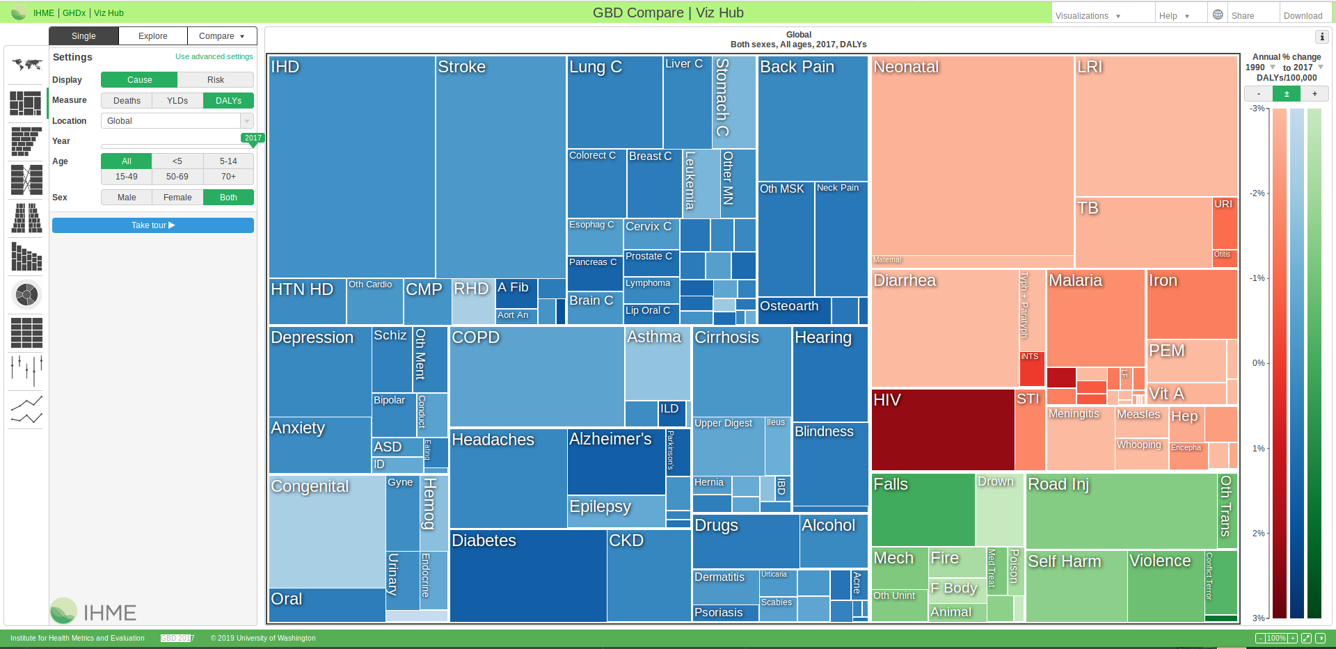
To understand this data, we need to focus on two key concepts / measures: the years lost of life (an estimate for how the extent to which someone’s life may have been cut short, due to an existing condition), and the years lived with disability (an estimate for how long a person has lived with the consequences of a condition). These measures are considered to be influenced by factors such as age, gender and the level of deprivation in the area of living - all ideally implemented as inputs in a Shiny app (but please see below for a similar solution implemented for the The Institute for Health Metrics and Evaluation’s dashboard for the Global Burden of Disease data).
The learning experience
Maite describes her experience as participant in the Accelerator programme:
I wanted to develop an interactive data visualisation for the Scottish Burden of diseases to present our results and design modern visualizations with the aim to reach a higher audience and increase the number of users that refer to our statistics and graphics in their reports and websites. […] Originally, I was going to produce a static tree map and one visualization but I managed, with the direction of the mentor from The Data Lab, to move to a higher level and produce the Shiny app. Public Health Scotland has agreed to fund further development of the interactive visualisation and to publish it in the ScotPHO website. I have also been presenting the results of the program to other teams in ISD.
For my part, I really enjoyed working with Maite and seeing her progress over time, from the initial planning stages of the Accelerator programme, to when Maite was able to deliver a comprehensive interactive visualisation for the Scottish Burden of Diseases data, using R Shiny.
Maite’s interactive Shiny solution will be deployed soon - updates to follow. For the time being, you can access the mentorship material used throughout the Accelerator programme freely in the following GitHub repo:
Constantinescu, A.C. (2018, August). Exploring the Scottish Burden of Diseases Data using R Shiny [R script]. Edinburgh, Scotland: The Data Lab Innovation Centre. Retrieved [Month] [Day], [Year], from https://github.com/TheDataLabScotland/Public_ScotGovAccelerator_2018