For this post, I’ve managed to find some extremely interesting historical event data offered by the Cline Center on this page. As you will see, this dataset can be quite challenging because of the sheer number of dimensions you could look at. With so many options, it becomes tricky to create visualisations with the ‘right’ level of granularity: not so high-level that any interesting patterns are obscured, but not too detailed and overcrowded either.
To quote the Cline Center’s own description of this data, it:
[…] covers the period 1945-2015 and includes several million events extracted from 14 million news stories. This data was produced using […] content from the New York Times (1945-2005), the BBC’s Monitoring Summary of World Broadcasts (1979-2015) and the CIA’s Foreign Broadcast Information Service (1995-2004). It documents the agents, locations, and issues at stake in a wide variety of conflict, cooperation and communicative events […].
Of the three sources, below we’ll explore the BBC dataset (“BBC Summary of World Broadcasts “), since it spans a fairly large period (1979 - 2015), and is also the largest among the three datasets offered. It can be downloaded here, and also comes with some metadata (in .csv format) presented here. Finally, you can also check out the variable codebook here.
Overview of the data
Before we dive in, it’s important to mention a few things about the structure of this BBC dataset. Here is a window onto how the original data looked, before I implemented any edits of my own:
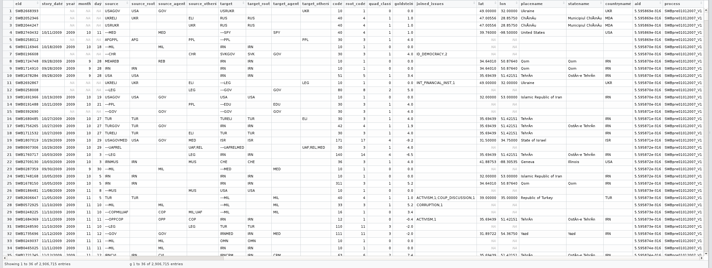
One thing you may notice, for instance, is that some characteristics of this dataset go against the set of data guidelines I’ve previously recommended: e.g., the source and target variables do not contain atomic values, but rather string together multiple values, as well as some punctuation characters. This and various other issues had to be addressed before actually starting to look at the data. If you’re interested, you can see my R code for this at the bottom of this page.
Finding a suitable level of granularity
First thing’s first: picking outcome variable(s). Of all those present, the goldstein variable appears most appropriate: it is continuous and measures conflict and cooperation in world events. We’ve also got a secondary measure for ’event importance’: total_sources (or the number of media sources which picked up a given event).
Next, let’s decide what these variables could vary across. Because various options are available, it’s difficult to choose what to show in graphs - or equally, how to show as much as you can, but in the cleanest, simplest way. One idea would be to average the Goldstein scale by year, within countries, and within country groups (labeled somewhat confusingly here as continent). Alternatively, we could pool all the data, and only look at country-wide averages. With 227 country / location names present in the data (!), measured across several decades each, it’s perhaps not immediately obvious what the best way forward is…
So we’ll use a trick to get the best of both worlds: we’ll create yearly averages for each country, plus country-wide averages for both our outcomes (goldstein and total_sources). We’ll actually be needing both levels of granularity within the same plot: a (pseudo-)caterpillar plot coming up soon.
 1
 2
 3
 4
 5
 6
 7
 8
 9
10
11
12
13
14
15
16
17
18
19
20
21
22
23
24
| # Averaging Goldstein ratings over country and by year:
goldstein_country_in_continent_by_year <-
data.table( aggregate( cbind( goldstein, total_sources ) ~
year + countryname + continent,
FUN = mean,
data = full_BBC_events_with_meta ) )
goldstein_country_in_continent <-
data.table( aggregate( cbind( goldstein, total_sources ) ~
countryname + continent,
FUN = mean,
data = full_BBC_events_with_meta ) )
# Now sorting the levels of the countryname variable within "continents" (zones):
goldstein_country_in_continent <- goldstein_country_in_continent[ order( continent, goldstein ), ]
correct_order <- unique( goldstein_country_in_continent$countryname )
setnames( goldstein_country_in_continent,
c( "goldstein", "total_sources" ),
c( "country_goldstein", "country_total_sources" ) )
two_level_aggregates <- join( goldstein_country_in_continent_by_year,
goldstein_country_in_continent )
two_level_aggregates[ , countryname := ordered( countryname, levels = correct_order ) ]
|
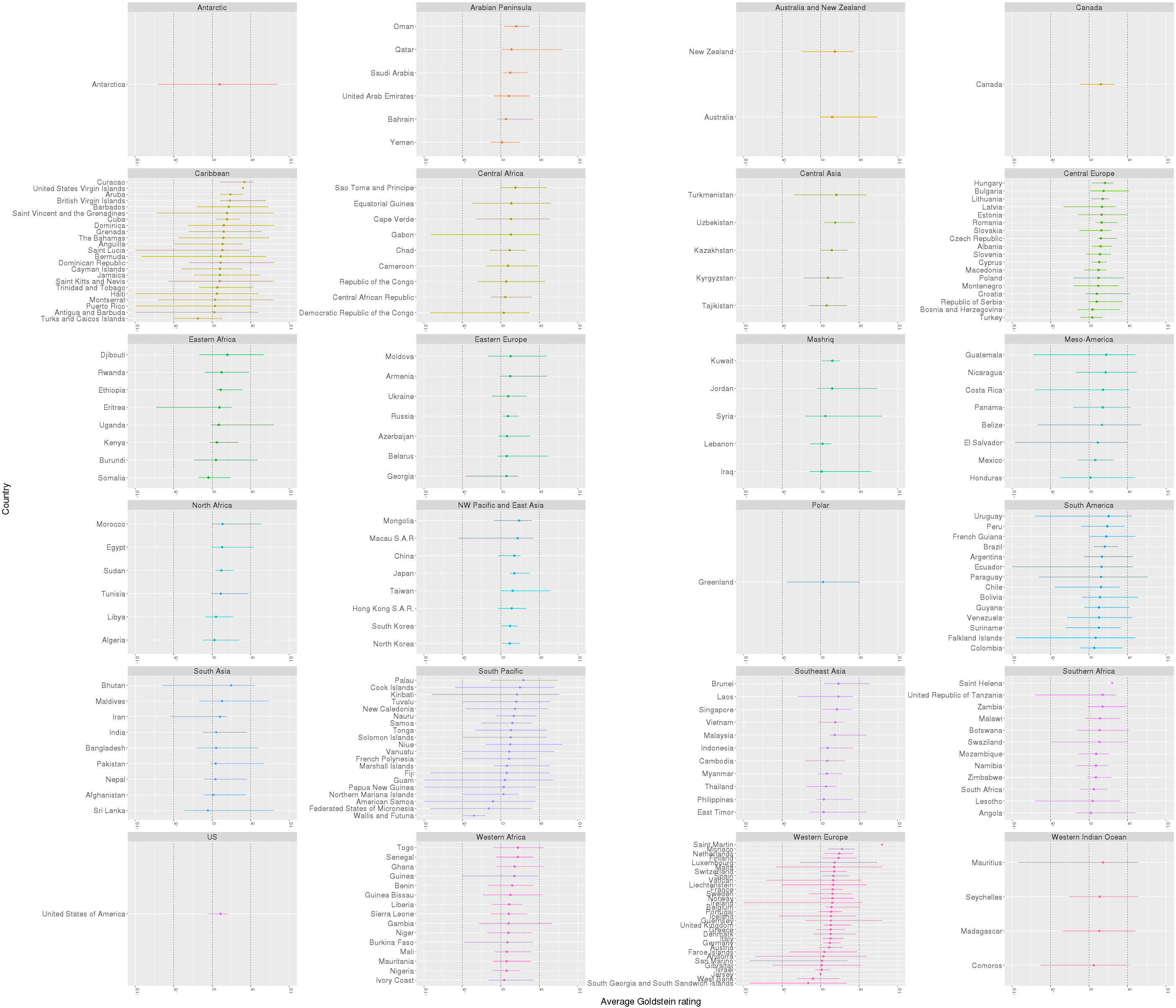
Plotting the full data
So I’ve gotten a bit creative here in trying to include all the countries available, within all the geographical zones. Because this graph would become completely illegible if I had included yearly datapoints too, I’ve instead resorted to showing the value ranges for each country (connecting the min and max rating achieved by each country between 1977-2015).
 1
 2
 3
 4
 5
 6
 7
 8
 9
10
11
12
13
14
15
| # Here we split the graph by area ("continent") - and show each one separately within its own panel:
ggplot( two_level_aggregates[ year > 1977, ],
aes( x = goldstein, y = countryname,
group = countryname, color = continent ) ) +
geom_vline( xintercept = 0, color = "black", lty = "dashed", size = 0.3 ) +
geom_vline( xintercept = -5, color = "black", lty = "dashed", size = 0.3 ) +
geom_vline( xintercept = 5, color = "black", lty = "dashed", size = 0.3 ) +
geom_line( stat = "identity" ) +
geom_point( aes( x = country_goldstein, y = countryname, color = continent ) ) +
facet_wrap( ~ continent, ncol = 4, scales = "free" ) +
xlim( -10, 10 ) +
theme( axis.text.x = element_text( angle = 90, hjust = 1, size = 12 ),
text = element_text( size = 22 ) ) +
guides( color = FALSE ) +
labs( color = "Area", x = "Average Goldstein rating", y = "Country" )
|
And the caterpillar plot below is the result - with countries ordered within each panel by the grand mean (country-level average) on the Goldstein scale, across the whole period assessed, and with lines representing the range of values.
Plotting slices of data
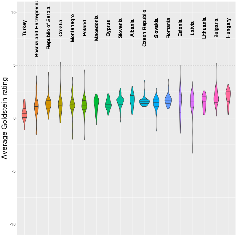
After looking at the big picture above (quite literally, too…), we might be interested to explore one specific area in more detail. This would also help with reducing the amount of information conveyed in a single plot. Say, for instance, we want to look at the types of Goldstein ratings for Central Europe only. We could slice the data accordingly, and visualize whereabouts on this scale the values cluster more for each country. So let’s create a violin plot:
 1
 2
 3
 4
 5
 6
 7
 8
 9
10
11
12
13
14
15
16
17
18
19
20
21
22
23
| violin <- ggplot( two_level_aggregates[ year > 1977 & continent == "Central Europe", ],
aes( y = goldstein, x = countryname,
group = countryname, fill = countryname ) ) +
geom_hline( yintercept = 0, color = "black", lty = "dashed", size = 0.3 ) +
geom_hline( yintercept = -5, color = "black", lty = "dashed", size = 0.3 ) +
geom_hline( yintercept = 5, color = "black", lty = "dashed", size = 0.3 ) +
geom_violin( position = "dodge",
draw_quantiles = c( 0.25, 0.50, 0.75),
trim = TRUE ) +
geom_text( aes( x = countryname, y = 8.5, label = countryname ), angle = 90, size = 6 ) +
ylim( -10, 10 ) +
guides( fill = FALSE ) +
theme( axis.text.y = element_text( size = 15 ),
axis.title.y = element_text( size = 25 ),
axis.title.x = element_blank(),
axis.text.x = element_blank(),
axis.ticks.x = element_blank() ) +
labs( y = "Average Goldstein rating" )
png( "ViolinCentralEurope.png", width = 800, height = 800 )
print( violin )
dev.off()
|
This is the result. It’s interesting to see that of the bunch, and according to this data, Turkey spends the most time on the fringes between cooperation and conflict, whereas e.g., Romania situates itself slightly above the midpoint of the scale the whole time (each violin shows a country’s data between 1977-2015).
Ok, so if you know the usual ways to simplify plots (e.g., those discussed by Stephen Few in Solutions to the Problem of Over-Plotting in Graphs, 2008), here is another trick: using animations. In R, you can do this with package gganimate, and get something like this:
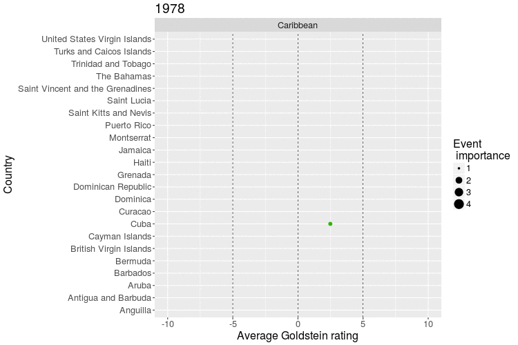
Not only does this solve the problem of including the yearly data in a way that’s easier to take in, but we’ve also managed to map the ’event importance’ measure onto the size of points! And all this without things looking ridiculously overcrowded.
Furthermore, the plot also reveals something interesting about this dataset: the way the Cline Center quantified text data from newspapers does present at least some degree of validity. As an example, you will see a data point for Haiti flash towards the negative end of the Goldstein scale in 1985. A quick search on Google reveals that this is related to a period of violent protests, and ultimately to president Duvalier being overthrown in Haiti:
In July of 1985, a referendum increased Duvalier’s power, angering much of the populace. In November 1985, opposition held protests in cities around the country. Law enforcement killed and arrested many protesters across the country.
But, returning to our topic here, you can create the .gif above with:
 1
 2
 3
 4
 5
 6
 7
 8
 9
10
11
12
13
14
15
16
17
| p <- ggplot( goldstein_country_in_continent_by_year[ continent == "Caribbean", ],
aes( x = goldstein, y = countryname,
group = countryname,
color = countryname,
size = total_sources,
frame = year,
cumulative = FALSE ) ) +
geom_vline( xintercept = 0, color = "black", lty = "dashed", size = 0.3 ) +
geom_vline( xintercept = -5, color = "black", lty = "dashed", size = 0.3 ) +
geom_vline( xintercept = 5, color = "black", lty = "dashed", size = 0.3 ) +
geom_point( ) + guides( color = FALSE ) +
xlim( -10, 10 ) +
theme( text = element_text( size = 16 ) ) +
labs( size = "Event\n importance", x = "Average Goldstein rating", y = "Country" ) +
facet_wrap( ~ continent, ncol = 2, scales = "free" )
gganimate( p, filename = "~/Desktop/Caribbean.gif", ani.width = 1400, ani.height = 500 )
|
You can also extend the plot to contain multiple panels, but that gets really hard to follow, really fast - so it’s probably something to avoid if possible… But if you want to try, here is how:
1
2
3
4
5
| # We're also using a trick to substitute the dataset from before with a new one
# but all of this without repeating any of the ggplot2 syntax above:
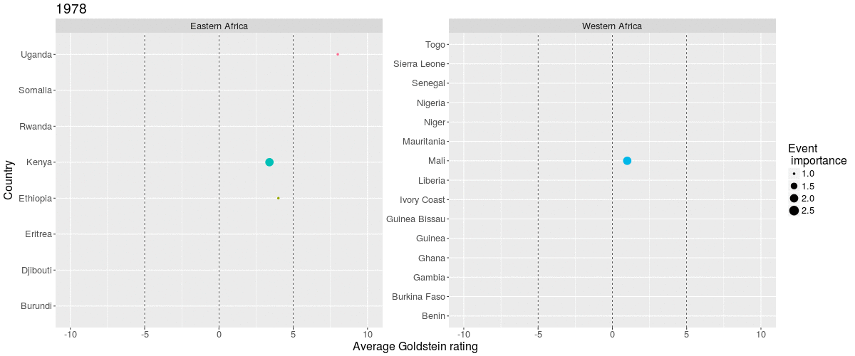
p2 <- p %+% goldstein_country_in_continent_by_year[ continent == "Western Africa" | continent == "Eastern Africa", ]
gganimate( p2, filename = "~/Desktop/EasternVsWesternAfrica.gif", ani.width = 1200, ani.height = 500 )
|
And you will get:
Ok, these are my current thoughts on how to tackle data with nested (years within countries) and crossed (countries between zones) variables. If you’ve been following up to this point, any comments and suggestions are welcome. By the way, all the work described here is on Github too.
Going further: Data cleaning & manipulations
See below for all the preliminary work that had to be carried out before actually plotting the data. Some of the things I’ve done include replacing unusual values with a missing code, or actually excluding missing data, as well as stripping unnecessary punctuation characters.
I also brought in external data from the rworldmaps package, and replaced country ISO3 codes with the full country names, besides adding in a grouping variable for countries (i.e., the Stern report country classification, which groups countries into 24 categories). I’ve done the same for the so-called CAMEO code variable, i.e., I got the CAMEO labels from the Cline codebook, and substituted them for the numeric codes in the data, to get more legible output.
I also split up any concatenated values I saw in order to get atomic measures. For instance, I split the source and target variables across multiple new columns. And I’ve done the same for the eid variable (event ID), which originally concatenates both the source and the event identifier (the latter being a numeric code).
In addition, I created measures for how many sources or targets an event is associated with, and used this as a proxy for ’event importance’: presumably, the bigger the event, the more sources it’s picked up by, and the more targets it involves.
Finally, I also merged the actual BBC event data with the its metadata (article publication dates and so on). Here is the code for all this:
  1
  2
  3
  4
  5
  6
  7
  8
  9
 10
 11
 12
 13
 14
 15
 16
 17
 18
 19
 20
 21
 22
 23
 24
 25
 26
 27
 28
 29
 30
 31
 32
 33
 34
 35
 36
 37
 38
 39
 40
 41
 42
 43
 44
 45
 46
 47
 48
 49
 50
 51
 52
 53
 54
 55
 56
 57
 58
 59
 60
 61
 62
 63
 64
 65
 66
 67
 68
 69
 70
 71
 72
 73
 74
 75
 76
 77
 78
 79
 80
 81
 82
 83
 84
 85
 86
 87
 88
 89
 90
 91
 92
 93
 94
 95
 96
 97
 98
 99
100
101
102
103
104
105
106
107
108
109
110
111
112
113
114
115
116
117
118
119
120
121
122
123
124
125
126
127
128
| # Here are the packages we will need:
library( data.table )
library( ggplot2 )
library( stringi )
library( stringr )
library( plyr )
library( rworldmap )
library( devtools )
# install_github( "dgrtwo/gganimate")
library( gganimate )
setwd( "your/path/goes/here" )
# Get data ----------------------------------------------------------------
BBC_events <- fread( "BBC_Summary_of_World_Broadcasts_1979_2015_.csv", na.strings = "" )
BBC_meta <- fread( "BBC_Summary_of_World_Broadcasts_1979_2015_MetaData.csv", na.strings = "" )
# Understanding and tidying the data --------------------------------------
# In keeping with a common data management recommendation, values within columns should represent atomic values
# i.e., each cell should contain just one value, instead of two or more. So we shall try to fix this for events so that event *sources* and *ids* are kept separate:
BBC_events[ , EIDSource := gsub( "[[:digit:]]","", BBC_events$eid ) ]
BBC_events[ , EIDEvent := gsub( "[[:alpha:]]","", BBC_events$eid ) ]
# Exclude events that have no date, or no lat and long, just in case we want to create a map of these data points ourselves later:
BBC_events <- BBC_events[ ! is.na( story_date ), ]
BBC_events[ , story_date := as.Date( story_date, format = "%m/%d/%Y" ) ]
BBC_events <- BBC_events[ ! is.na( lat ) & ! is.na( lon ), ]
# These source and target codes don't mean much in themselves.
# They seem to just be ISO3 country codes.
# So I'm going to match them up to the full country names, extracted from the rworldmap package.
data( countryRegions, envir = environment(), package = "rworldmap" )
# Can also get continents / Stern report area classifications, from the very same rworldmap package:
BBC_events[ , continent := mapvalues( BBC_events$countryname,
from = countryRegions$ISO3,
to = countryRegions$GEO3 ) ]
# Get proper country names from ISO3 codes:
BBC_events[ , countryname := mapvalues( BBC_events$countryname,
from = countryRegions$ISO3,
to = countryRegions$ADMIN ) ]
# There are a few codes in this BBC dataset that are unrecognized, and which should be replaced with missing values:
unrecognized_iso <- unique( BBC_events$countryname )[ nchar( unique( BBC_events$countryname ) ) < 4 ]
BBC_events[ , countryname := ifelse( countryname %in% unrecognized_iso, NA, countryname ) ]
BBC_events[ , continent := ifelse( continent %in% unrecognized_iso, NA, continent ) ]
# Cleaning source / target variables:
# Remove punctuation from these character vars:
BBC_events[ , target := str_trim( str_extract( target, "[[:alpha:]]+" ), side = "both" ) ]
BBC_events[ , source := str_trim( str_extract( source, "[[:alpha:]]+" ), side = "both" ) ]
table( nchar( BBC_events$target ) )
table( nchar( BBC_events$source ) )
# Gotta split strings into groups of 3 ...
targets_list <- stri_extract_all_regex( BBC_events$target, '.{1,3}' )
targets_data_matrix <- plyr::ldply( targets_list, rbind )
setnames( targets_data_matrix, paste( "target", 1:9, sep = "_" ) )
sources_list <- stri_extract_all_regex( BBC_events$source, '.{1,3}' )
sources_data_matrix <- plyr::ldply( sources_list, rbind )
setnames( sources_data_matrix, paste( "source", 1:9, sep = "_" ) )
# Get a measure of how many sources and or targets an entry has.
# Presumably, the bigger the event, the more sources it's picked up by, and the more targets it involves.
BBC_events[ , total_sources := unlist( lapply( sources_list, length ) ) ]
BBC_events[ , total_targets := unlist( lapply( targets_list, length ) ) ]
# Replace each code by its actual meaning to help with deciphering dataset:
source_target_dict <- fread( "SourceOrTargetCodes_ClineBBCData.csv" )
targets_data_matrix <- data.table( mapvalues( as.matrix( targets_data_matrix ),
from = source_target_dict$Code,
to = source_target_dict$`Source/Target` ) )
sources_data_matrix <- data.table( mapvalues( as.matrix( sources_data_matrix ),
from = source_target_dict$Code,
to = source_target_dict$`Source/Target` ) )
full_BBC_events <- data.table( BBC_events, sources_data_matrix, targets_data_matrix )
# Joining meta data with main data:
setnames( BBC_meta, "pubdate", "story_date" )
BBC_meta[ , story_date := as.Date( story_date, format = "%m/%d/%Y" ) ]
full_BBC_events_with_meta <- join( full_BBC_events, BBC_meta, by = c( "aid", "story_date" ) )
# Remove unnecessary columns for simplicity:
full_BBC_events_with_meta$original_source <- NULL
full_BBC_events_with_meta$process <- NULL
# Trying to understand the structure of this dataset:
table( table( full_BBC_events_with_meta$eid ) ) # Seems like events are unique
table( table( full_BBC_events_with_meta$aid ) ) # Seems like articles repeat themselves, confusingly
table( table( full_BBC_events_with_meta$code ) ) # An event's code for: Conflict and Mediation Event Observation (CAMEO code)
table( table( full_BBC_events_with_meta$root_code ) ) # Super-ordinate CAMEO code, with following dictionary:
# Replacing CAMEO codes with their labels, for more meaningful output to be possible later:
CAMEO_root_code <- 1 : 20
CAMEO_label <- c( "Make public statement", "Appeal", "Express intent to cooperate",
"Consult", "Engage in diplomatic cooperation",
"Engage in diplomatic cooperation", "Provide aid", "Yield",
"Investigate", "Demand", "Disapprove", "Reject", "Threaten",
"Protest", "Exhibit force posture", "Reduce relations", "Coerce",
"Assault", "Fight", "Use unconventional mass violence")
full_BBC_events_with_meta[ , root_code := mapvalues( root_code, CAMEO_root_code, CAMEO_label ) ]
|
This content was first published on The Data Team @ The Data Lab blog.
