I’ve recently come across data.gov — a huge resource for open data. At the time of writing, there are close to 17,000 freely available datasets stored there, including this one offered by the LAPD. Interestingly, this dataset includes almost 1.6M records of criminal activity occurring in LA since 2010 — all of them described according to a variety of measures (you can read about them here).
Using information like the date and time of a crime, its location (longitude & latitude), and the type of crime committed (among other things), you can come up with some pretty interesting visualizations. For this intro to plotting geographical data, I’ll be using R and showing you a gradual approach to building your graphs. Keep reading if you want to find out more!
Packages and data
So, our first step will be to download and read all the data into R, followed by some minor data cleaning. But before we start, we’ll also need to (install &) load some particular R packages:
 1
 2
 3
 4
 5
 6
 7
 8
 9
10
11
12
13
14
15
16
| # Packages to install, if necessary:
# install.packages( c( "data.table", "tidyr", "stringr", "lubridate", "ggplot2", "ggmap", "ggrepel", "jsonlite" ) )
library( data.table )
library( tidyr )
library( stringr )
library( lubridate )
library( ggplot2 )
library( ggmap )
library( ggrepel )
library( jsonlite )
# Read in data:
setwd("/your/path/here")
crime <- fread( "CrimeData.csv", na.strings = c( "", "NA", "-", "X" ) )
head( crime )
|
Data cleaning
Next, we’re moving on to some data cleaning:
 1
 2
 3
 4
 5
 6
 7
 8
 9
10
11
12
13
14
15
16
17
18
19
20
21
22
23
24
25
26
27
| # Extract numeric coordinates from character string:
lat_and_long <- str_split( crime$Location, ", " )
lat <- sapply( lat_and_long, "[", 1 )
lat <- as.numeric( str_replace( lat, "\\(", "" ) )
crime[ , lat := lat ]
long <- sapply( lat_and_long, "[", 2 )
long <- as.numeric( str_replace( long, "\\)", "" ) )
crime[ , long := long ]
# Remove all whitespace from variable names:
setnames( crime, str_replace_all( names( crime ), " ", "" ) )
# Format dates:
crime[ , DateOccurred := as.Date( DateOccurred, format = "%m/%d/%Y" ) ]
crime[ , MonthOccurred := lubridate::month( DateOccurred, label = TRUE ) ]
crime[ , YearOccurred := year( DateOccurred ) ]
crime[ , DateReported := as.Date( DateReported, format = "%m/%d/%Y" ) ]
crime[ , YearReported := year( DateReported ) ]
# Split the multiple 'MOCodes' strings concatenated within each cell across different columns:
crime <- separate( crime, "MOCodes", into = paste( "MOCode", 1:10, sep = "_" ), sep = " " )
|
Getting a Google Map
After the cleaning process, we can now download an actual map of LA from Google, since we will be plotting our own crime data points on top of it:
1
2
3
|
map <- get_map( location = 'Los Angeles', zoom = 12, maptype = "roadmap" )
|
Building ggplot2 graphs incrementally
And now we’re ready for the best part — we can do some plotting and actually see what’s been going on in LA over the last few years, in terms of crimes. As I mentioned before, we’ll adopt a gradual approach using the ggplot2 R package. In other words, we’ll build the graphs layer by layer, separating them by a + sign. So we’ll start somewhere simple:
1
2
3
4
5
6
7
8
9
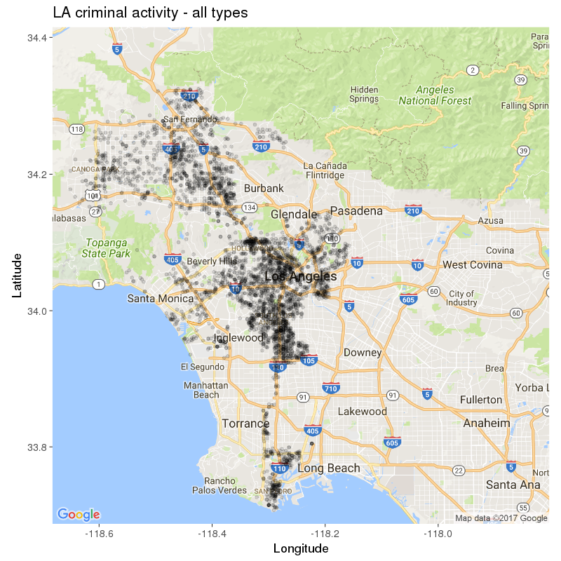
| # Version 1: simplest form
bare_version <- ggmap( map ) +
geom_point( data = crime[ TimeOccurred > 2300 & VictimAge < 18 & YearOccurred > 2011, ],
aes( x = long, y = lat ),
alpha = .15, color = "black", size = 2 ) +
labs( x = "Longitude", y = "Latitude", title = "LA criminal activity - all types" ) +
theme_grey( base_size = 18 )
bare_version
|
What we’ve done above (mainly) is grab the Google Map we saved earlier,and add our own layer of data to it, using geom_point(). As this is a fairly large dataset, we also sliced the data for the plot, which now includes only crimes occurring after 11pm, involving underage victims, and occurring post-2011. You can see the result below, where every black point represents a reported incident:
Why stop here though? ggplot2 offers such a wide variety of options, so let’s use a few more. For instance, we can split the view according to one categorical variable - for instance, the year of occurrence. Like so:
1
2
3
| # Version 2: creating one facet
version_with_one_facet <- bare_version + facet_wrap( ~ YearOccurred, ncol = 3 )
version_with_one_facet
|
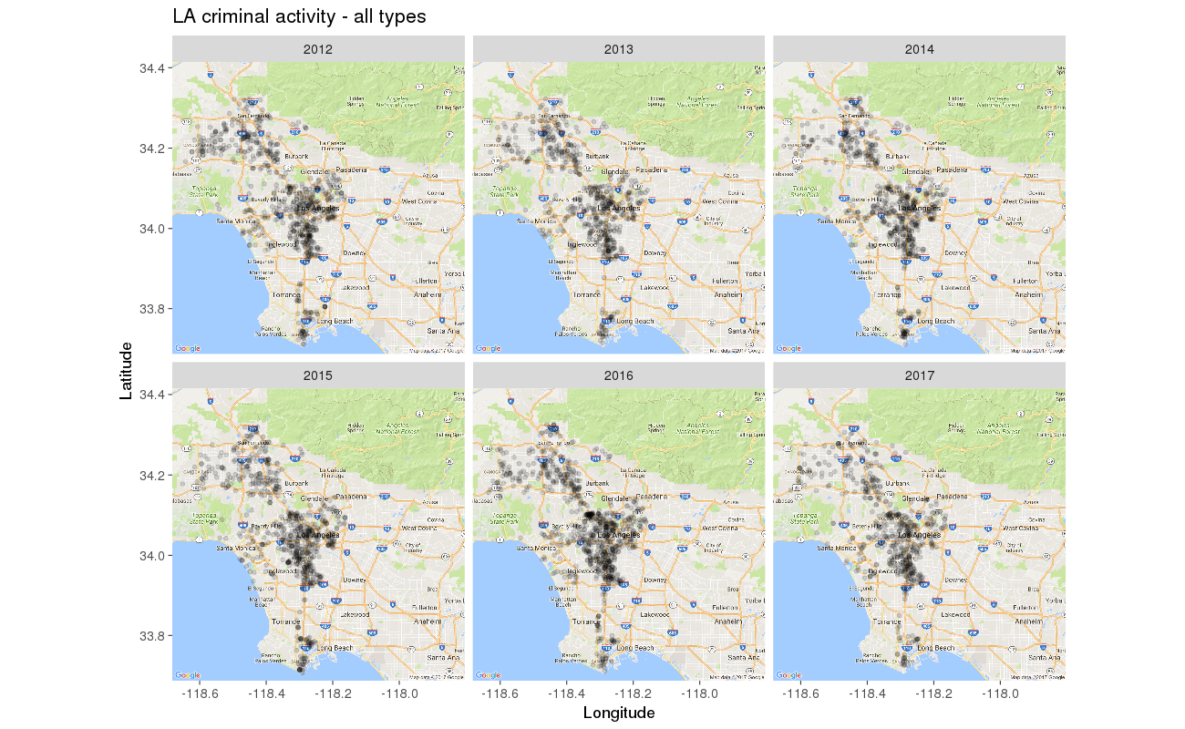
Sadly, over a period of 6 years, no decrease in the amount of LA crime seems to have occurred… But maybe we can get a better idea if we further split the data by a second categorical variable, for a more detailed view over time:
1
2
3
| # Version 3: using multiple facets
version_with_two_facets <- bare_version + facet_grid( YearOccurred ~ MonthOccurred )
version_with_two_facets
|
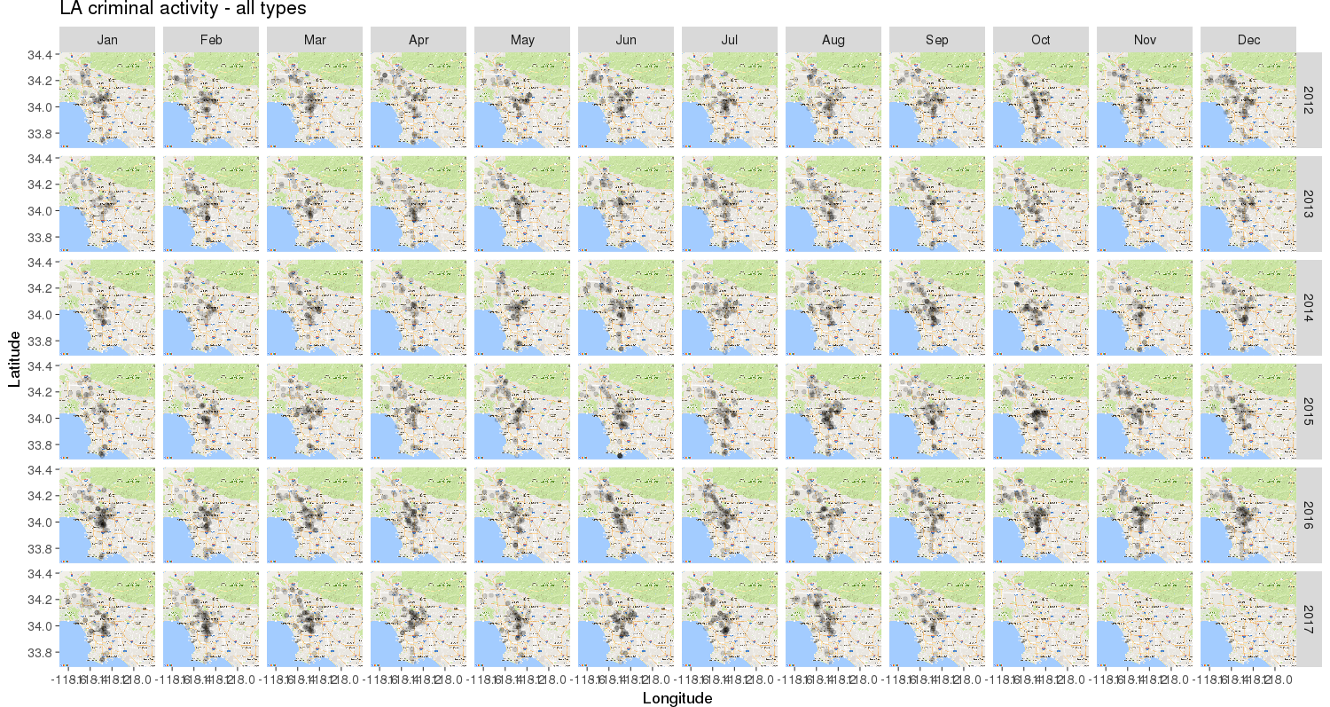
Unless we use some inferential approach to prove otherwise, if anything it looks like over time, criminal incidents rose slightly and/or started concentrating towards the middle of the map… The final three panels might look like an exception, but they do not mean that crime “has vanished” - rather, there simply is no data available for October, November & December 2017.
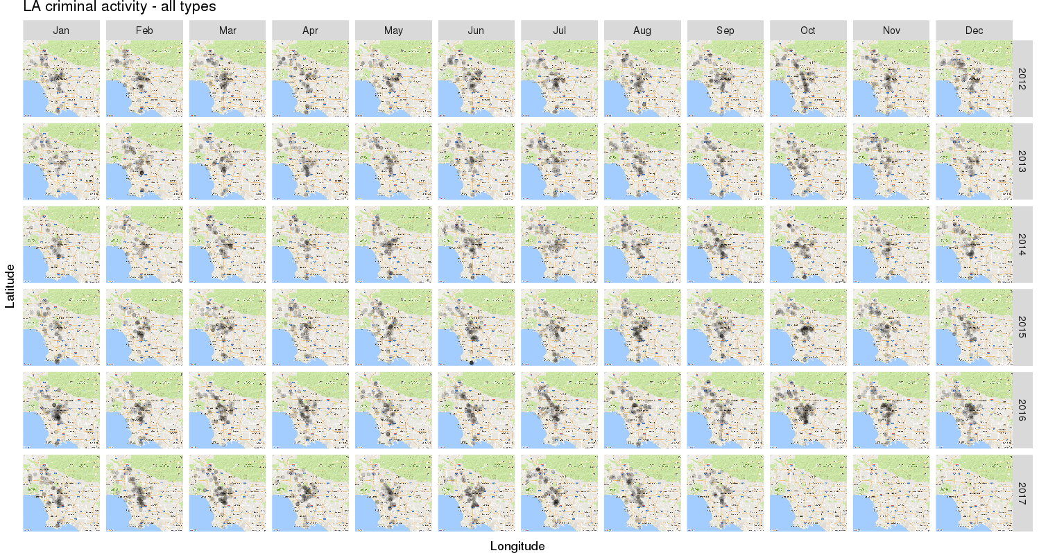
If we want to polish and de-clutter the view a bit, we can also remove axis tickmarks and labels:
1
2
3
4
5
6
7
| # Version 4: Remove x and y axis tick marks & labels due to clutter
version_with_two_facets_no_labels <- version_with_two_facets +
theme( axis.text.x = element_blank(),
axis.ticks.x = element_blank(),
axis.text.y = element_blank(),
axis.ticks.y = element_blank() )
version_with_two_facets_no_labels
|
Importantly, so far we’ve been looking at all the crime types in this dataset pooled together - be it incidents classed as terrorism, road rage, kidnapping, animal neglect and so on. It would probably make more sense to look at these separately, so this is what we’ll do next.
By consulting the list of MO codes for this dataset (available here), we can see what each code means. Hence we are able to do the following:
 1
 2
 3
 4
 5
 6
 7
 8
 9
10
11
12
13
14
15
16
17
18
19
20
21
22
23
24
25
26
27
28
29
30
31
32
33
34
| # Isolating specific types of crime, to spot any trends. For this, all MO columns
# (MOCode_1 to MOCode_10) created earlier need to be checked simultaneously for
# a given set of values.
Internet_crimes <- c( "1904", "1905", "1908", "1909", "1911", "1914", "1915", "1916" )
narcotics_prostitution <- c( "0907", "0908" )
Internet_crime_data <-
crime[ MOCode_1 %in% Internet_crimes | MOCode_2 %in% Internet_crimes|
MOCode_3 %in% narcotics_prostitution | MOCode_4 %in% narcotics_prostitution |
MOCode_5 %in% Internet_crimes | MOCode_6 %in% Internet_crimes |
MOCode_7 %in% Internet_crimes | MOCode_8 %in% Internet_crimes |
MOCode_9 %in% Internet_crimes | MOCode_10 %in% Internet_crimes, ]
Narc_pros_crime_data <-
crime[ MOCode_1 %in% narcotics_prostitution | MOCode_2 %in% narcotics_prostitution |
MOCode_3 %in% narcotics_prostitution | MOCode_4 %in% narcotics_prostitution |
MOCode_5 %in% narcotics_prostitution | MOCode_6 %in% narcotics_prostitution |
MOCode_7 %in% narcotics_prostitution | MOCode_8 %in% narcotics_prostitution |
MOCode_9 %in% narcotics_prostitution | MOCode_10 %in% narcotics_prostitution, ]
# Now to plot these datasets. Starting with Internet crimes over time:
ggmap( map ) +
geom_point( data = Internet_crime_data,
aes( x = long, y = lat ),
alpha = .15, color = "black", size = 2 ) +
labs( x = "Longitude", y = "Latitude",
title = "LA criminal activity - Internet crime" ) +
facet_wrap( ~ YearOccurred ) +
theme( axis.text.x = element_blank(),
axis.ticks.x = element_blank(),
axis.text.y = element_blank(),
axis.ticks.y = element_blank() ) +
theme_grey( base_size = 18 )
|
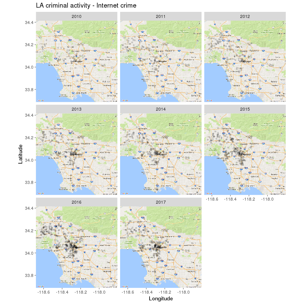
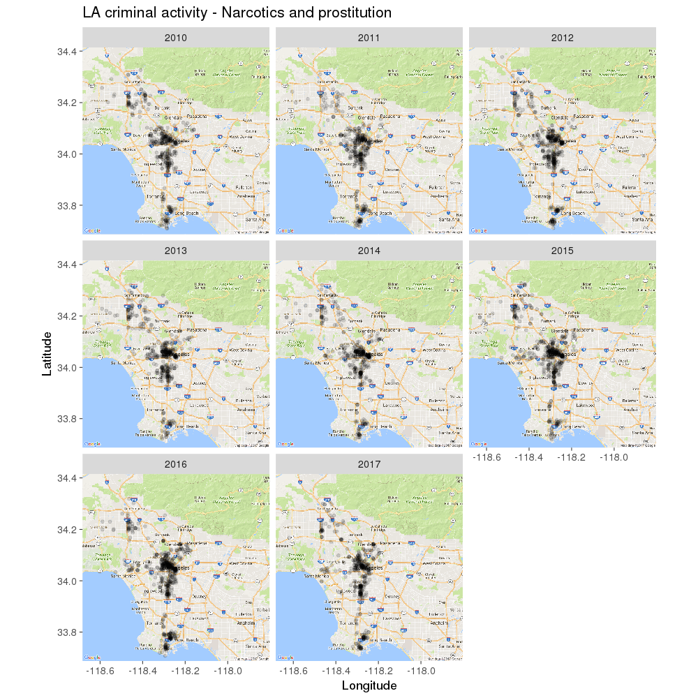
As you can see (and may have suspected), online crimes have gradually increased since 2010. For drugs and prostitution, it’s a different story: despite hopes for a decline in this area, the number of incidents reported looks roughly the same over time:
 1
 2
 3
 4
 5
 6
 7
 8
 9
10
11
12
13
| # Drugs and prostitution:
ggmap( map ) +
geom_point( data = Narc_pros_crime_data,
aes( x = long, y = lat ),
alpha = .15, color = "black", size = 2 ) +
labs( x = "Longitude", y = "Latitude",
title = "LA criminal activity - Narcotics and prostitution" ) +
facet_wrap( ~ YearOccurred ) +
theme( axis.text.x = element_blank(),
axis.ticks.x = element_blank(),
axis.text.y = element_blank(),
axis.ticks.y = element_blank() ) +
theme_grey( base_size = 18 )
|
It would be interesting to see where the tourist ‘hotspots’ may be located in LA, relative to the incidents marked in the previous plot. The expectation here would be that drug-related activity and prostitution should show little overlap with these famous / busy places.
The code below was inspired by Matias Andina, and his question on StackOverflow. What does it do? It searches for the first 20 matches for a keyword in Google Maps, within a specific radius from the middle of LA. After these matches are retrieved, they are simply added in as another layer alongside the previously mapped crime data. All this is possible with an API key - which you can generate yourself using the advice from the original link.
 1
 2
 3
 4
 5
 6
 7
 8
 9
10
11
12
13
14
15
16
17
18
19
20
21
22
23
24
25
26
27
28
29
30
31
32
33
34
35
36
37
38
39
40
41
42
43
44
45
46
47
48
49
50
51
52
53
54
55
56
57
58
59
60
61
62
63
| LA_centre_coords <- c( 34.052235, -118.243683 )
get_your_own <- readLines( "GoogleMapsAPIKey.txt" )
pinpoint_locations <- function( location, radius, keyword, print.query = FALSE ){
# radius is in meters
# location will represent a pair of coordinates searched for by hand
coord_pair <- paste( location[1], location[2], sep = "," )
baseurl <- "https://maps.googleapis.com/maps/api/place/nearbysearch/json?"
google_key <- get_your_own # Instructions in original stackoverflow link
query <- paste( baseurl,
"location=", coord_pair, "&radius=", radius,
"&keyword=",
# Originally: "&types=food|restaurant&keyword=",
# Can get other 'nearby' types from:
# https://developers.google.com/places/supported_types
keyword,"&key=", google_key,
sep = "" )
if ( print.query == TRUE ) {
print( query )
}
query_results <- jsonlite::fromJSON( URLencode( query ) )
lat_long <- data.frame( lat = query_results$results$geometry$location$lat,
long = query_results$results$geometry$location$lng )
places <- query_results$results$name
output <- cbind( places, lat_long )
return( output )
}
tourist_landmarks <- pinpoint_locations( location = LA_centre_coords,
radius = 30000,
keyword = "tourist attractions",
print.query = FALSE )
# Label some points
ggmap( map ) +
geom_point( data = Narc_pros_crime_data,
aes( x = long, y = lat ),
alpha = .15, color = "black", size = 2.5 ) +
labs( x = "Longitude", y = "Latitude",
title = "LA criminal activity (2010-2017): Narcotics and prostitution
vs. typical tourist attractions" ) +
theme( axis.text.x = element_blank(),
axis.ticks.x = element_blank(),
axis.text.y = element_blank(),
axis.ticks.y = element_blank() ) +
geom_point(data = tourist_landmarks,
aes( x = long, y = lat ), color = "red", size = 2 ) +
geom_label_repel( data = tourist_landmarks,
aes( x = long, y = lat, label = places ),
force = 40,
fill = "white", box.padding = unit( 0.3, "lines" ),
label.padding = unit( 0.1, "lines" ),
segment.color = "red", segment.size = 0.3 )
|
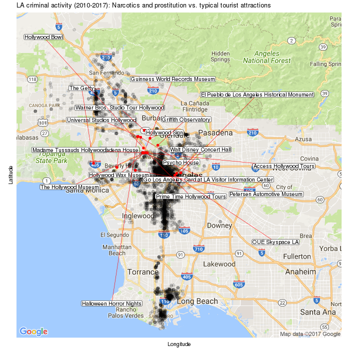
As expected, there isn’t very much overlap between popular touristy areas in LA, and the areas where drug and prostitution activity tends to occur…
So there you go. I hope this post was useful and managed to show you a few things you can do with ggplot2, if you have geographical data you want to plot. For those interested, the full R script for this post can be found on GitHub here.
This content was first published on The Data Team @ The Data Lab blog.
