If you’ve wondered how page views may vary in response to website changes, you’ve come to the right place. Setting up your website around a GitHub repo (see options: Netlify + Hugo, and GitHub Pages + Jekyll) is a great way to ensure that this is a smooth process. The beauty of relying on GitHub to store your site is that you are creating an effortless log of site changes as you go, without having to devote attention to this as a separate process.
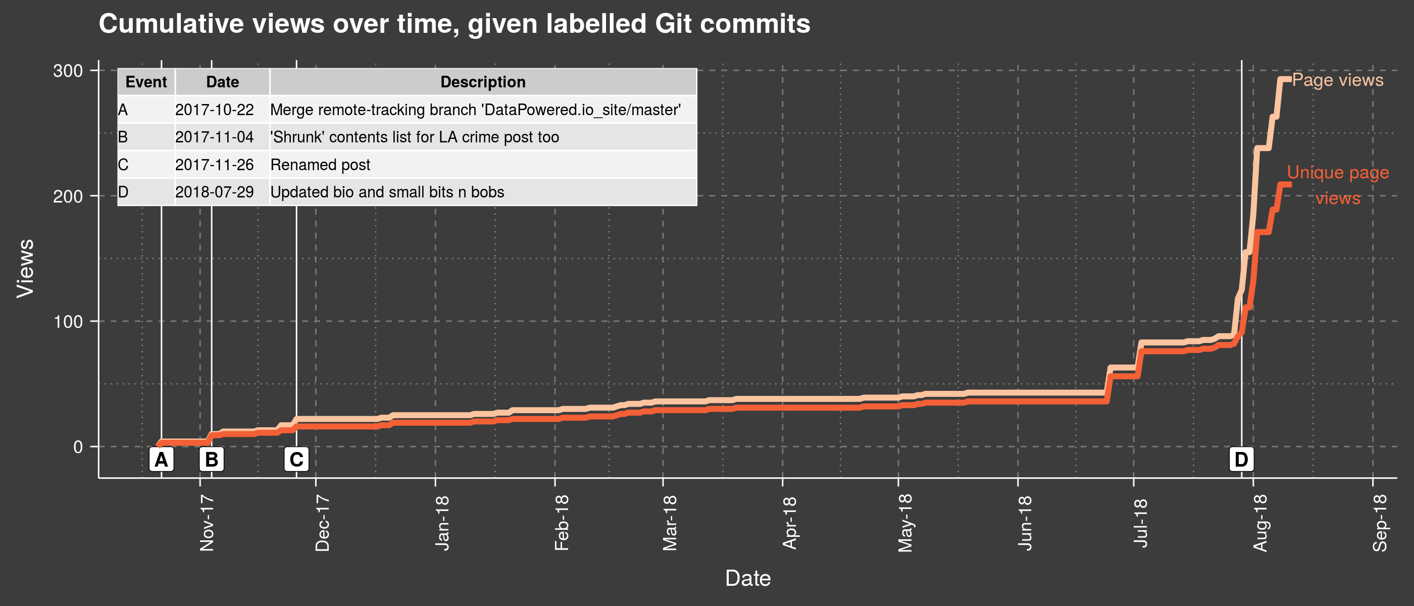
Take for instance the plot above: it gives a good overview of what was happening with my views in parallel with various website updates. You can see for example that views took off shortly after a bio update. While this of course doesn’t mean the bio update caused the increase, following such incidents over time could be informative and show some interesting patterns.
To get started, you’ll need two things: to extract your history of commits (git log), and to download your Google Analytics data. Keep reading if you want more details on the entire process.
Getting the data
Setting up a Google Analytics account will allow you to download .csv reports of page views and other measures directly from the platform: see the Behaviour Tab → Overview → View full report (botton right). You can also restrict the interval of interest using specific dates. Another route could be via the R package googleAnalyticsR).
To give a quick example, I’ve exported some data directly from Google Analytics as a .csv file, i.e., daily views (unique and otherwise) for my home page. Depending on what you are trying to do, it might be worth looking into other pages separately, or the total views across all pages / daily sessions.
You should get something of this nature:
| Day Index | Pageviews | Unique Pageviews | Avg. Time on Page |
|---|
| 10/15/17 | 0 | 0 | 00:00:00 |
| 10/16/17 | 19 | 16 | 00:12:17 |
| 10/17/17 | 6 | 6 | 00:00:13 |
Once that is taken care of, you can also extract your git log in a format of your choice. Bring up a Terminal and type:
cd /my/website/repo/
git log --pretty='format:"%an"~"%ai"~"%s"' > /my/path/Events.csv
What I’ve chosen to do above is structure my commit history into individual rows containing: the user name associated with the commit (%an), its date-time with timezone offset (%ai), and the title of the commit (%s) - all delimited by a tilde sign (~). You can pick any other separator you wish, as long as it is not already present anywhere else in the output. Then the output is directed to a .csv file, with a title, and at a location of your choice.
Alternatively, you can get rid of the timezone offset and request just local time, by following the code example below. For other types of information you can chain to the same query, check out Devhints.
git log --pretty='format:"%an"~"%ad"~"%s"' --date=local
Reading in the data
Now that we’re armed with both Google Analytics data and GitHub logs, we can set the scene for the work lying ahead in R (i.e., creating the plot at the top of this post).
 1
 2
 3
 4
 5
 6
 7
 8
 9
10
11
12
13
14
15
16
17
18
19
20
21
22
23
24
25
26
27
28
29
30
| # Packages ----------------------------------------------------------------
# library( devtools )
# install_github( "cttobin/ggthemr" )
library( data.table )
library( stringr )
library( plyr )
library( tidyr )
library( ggplot2 )
library( scales ) # to access breaks/formatting functions
library( gridExtra )
library( ggthemr )
ggthemr( "chalk", type = "outer", layout = "scientific", spacing = 2 )
setwd( "/your/dir/" )
# Read in data ------------------------------------------------------------
# Reading in GitHub log, specifying the ~ separator we used earlier.
git_commits <- fread( "Events.csv",
sep = "~", header = FALSE )
setnames( git_commits, c( "User", "Date", "Event" ) )
# In this case, almost all commits are from the same user, so shall remove from data:
git_commits[ , User := NULL ]
google_analytics_measures <- fread( "Analytics20171001-20180811.csv" )
setnames( google_analytics_measures, c( "Date", "PageViews", "UniquePageViews", "AverageTimeOnPage" ) )
|
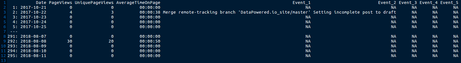
You’ve already seen a snippet of the Google Analytics data above. The GitHub log should look something like this after the manipulations carried out in R (minus the User column which was deleted above):
| User | Date | Event |
|---|
| CaterinaC | 2017-10-17 00:40:45 +0100 | Added pygments syntax highlighting for posts |
| CaterinaC | 2017-10-16 22:43:32 +0100 | Scaled background image |
| CaterinaC | 2017-10-16 22:32:54 +0100 | Merge remote-tracking branch ‘DataPowered.io_site/master’ |
Merging Google Analytics and GitHub commits
Now let’s proceed to some further operations, followed by merging the git log with the daily Google Analytics data:
 1
 2
 3
 4
 5
 6
 7
 8
 9
10
11
12
13
14
15
16
17
18
19
20
21
22
23
24
25
26
27
28
29
| # Data prep ---------------------------------------------------------------
# Converting to Date class:
google_analytics_measures[ , Date := as.Date( Date, format = "%m/%d/%y" ) ]
# Extracting just the date part from full string, and also converting to Date class:
git_commits[ , Date := substr( Date, 1, 10 ) ]
git_commits[ , Date := as.Date( Date, format = "%Y-%m-%d" ) ]
# There is a choice to make here between keeping the git log as is (long format),
# or switching to wide format (splitting commit titles across multiple columns if they occurred in the same day).
# Will demonstrate the latter approach.
# First choose some 'separator' for events which does not occur anywhere within the text,
# and supply it below as the 'collapse' argument of paste():
git_commits_wide <- aggregate( Event ~ Date,
FUN = function( x ){ paste( x, collapse = "___" ) },
data = git_commits )
# Find the maximum number of commits in a day, i.e., the no. of columns to split text across:
maximum_commits_in_a_day <- max( table( git_commits$Date ) )
git_commits_wide <- separate( git_commits_wide,
Event,
into = paste( "Event", 1 : maximum_commits_in_a_day, sep = "_"),
sep = "___" )
# Finally, join by date is now possible:
views_time_events <- setDT( join( google_analytics_measures, git_commits_wide, by = "Date" ) )
|
At this point, the joined / merged object views_time_events looks like so:
Plotting the data
From here, a good next step would be to plot the data. We can just use the events under Event_1, guaranteed to have a value each time a commit was made on a given day (the other columns will only be populated if multiple commits were made on the same date). Further Event-type columns could also be incorporated into the graph by adding to the tabularised ’legend’, and to the LETTERS below:
 1
 2
 3
 4
 5
 6
 7
 8
 9
10
11
12
13
14
15
16
17
18
19
20
21
22
23
24
25
26
27
28
29
30
31
32
33
34
35
36
37
38
39
40
41
42
43
44
45
46
47
48
49
50
51
52
53
54
55
56
57
58
59
60
61
| # Graphs ------------------------------------------------------------------
# Create an index of events to annotate on the plot:
single_event_index <- na.exclude( views_time_events[ , c( "Date", "Event_1" ) ] )
single_event_index <- cbind( Event = LETTERS[ 1 : nrow( single_event_index ) ], single_event_index )
names( single_event_index ) <- c( "Event", "Date", "Description" )
# # Export to png:
# png( "ViewsVsTimeWithCommitLabels.png",
# width = 14,
# height = 6,
# units = "in", res = 200 )
# Setting the scene:
ggplot( data = views_time_events,
aes( x = Date, y = cumsum( UniquePageViews ) ) ) +
# Marking location of events, and labelling them with letters:
geom_vline( xintercept = views_time_events[ ! is.na( Event_1 ), Date ],
lwd = 0.5, color = "white" ) +
geom_label( data = single_event_index,
aes( x = Date, y = -10,
label = LETTERS[ 1 : nrow( single_event_index ) ] ),
#str_wrap( Event_1, width = 18 )
size = 5, angle = 90,
color = "black", fontface = 2 ) +
# Draw line of cumulative page views, and label it:
geom_line( aes( x = Date, y = cumsum( PageViews ) ),
color = "#fcc49f", size = 2 ) +
annotate( "text",
y = max( cumsum( views_time_events$PageViews ) ),
x = max( views_time_events$Date ) + 12,
label = str_wrap( "Page views", width = 15 ),
size = 4.5, fontface = 1,
color = "#fcc49f" ) +
# Draw line of cumulative UNIQUE page views, and label it also:
geom_line( size = 2, color = "#f46036" ) +
annotate( "text",
y = max( cumsum( views_time_events$UniquePageViews ) ),
x = max( views_time_events$Date ) + 12,
label = str_wrap( "Unique page views", width = 15 ),
size = 4.5, fontface = 1,
color = "#f46036" ) +
# Tweak the theme and surrounding text:
theme( text = element_text( size = 16 ),
axis.text.x = element_text( angle = 90 ) ) +
ggtitle( "Cumulative views over time, given labelled Git commits" ) +
ylab( "Views" ) +
xlab( "Date" ) +
scale_x_date( breaks = date_breaks( "months" ), labels = date_format( "%b-%y" ) ) +
# Add event index as grob - will serve as legend for the letter codes:
annotation_custom( tableGrob( data.frame( single_event_index ),
rows = NULL,
theme = ttheme_default( base_size = 11,
core = list( fg_params = list( hjust = 0, x = 0 ) ),
rowhead = list( fg_params = list( hjust = 0, x = 0 ) ) ) ),
xmin = quantile( as.numeric( views_time_events$Date ), probs = 0.22 ),
xmax = NA,
ymax = 247,
ymin = NA )
# dev.off()
|
You’ll find the resulting plot at the top of this post.
Going further
A good way to take this further would be to have a think about what sorts of events could meaningfully be tied to changes in views (given a certain lag). This may be more than website updates, and might also include things like networking (e.g., if people come across your site when searching for you online after having met you). Importing your Google Calendar could come in handy here, so you might want to check out R packages like googlecalendar and gcalendar.
You can get my full R code here and explore things further.
